
2024
GRABOO — FOOD DELIVERY APP
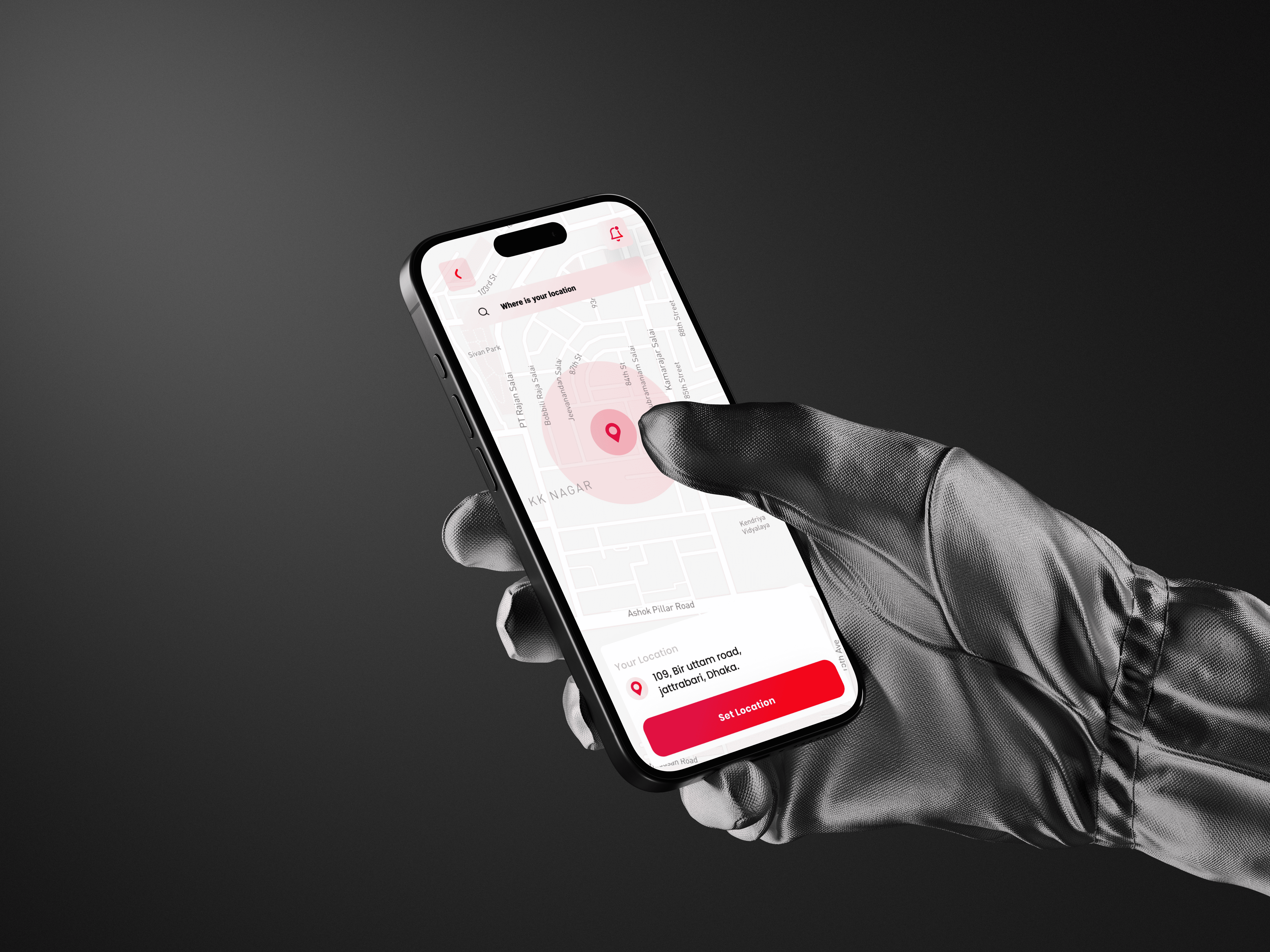
Graboo is a mobile-first food delivery product designed to simplify ordering from local restaurants, home kitchens, and trusted vendors.
UI/UX
MOBILE APP (AND)
ABOUT THE BRAND
Graboo® is a Dhaka-based food delivery brand dedicated to making meal ordering reliable and stress-free. The brand represents urban energy and youthful convenience-a platform that connects local restaurants to city residents who juggle work, study, and travel. Visually, Graboo embraces an energetic color palette inspired by street food culture, paired with modern typography and intuitive iconography. The identity is intentionally clean yet bold, balancing vibrancy with functional precision. Graboo positions itself as a dependable companion-fast when users need it, comforting when they don’t have time to think twice.
PROJECT OVERVIEW:
Graboo is a mobile-first food delivery product designed to simplify ordering from local restaurants, home kitchens, and trusted vendors. The objective was to craft a clean browsing experience, transparent pricing, and a friction-reduced checkout so users can order confidently and without effort.This case study covers the end-to-end creation of Graboo’s mobile experience. Scope included user research, journey mapping, information architecture, high-fidelity UI, and a component library ready for engineering. The work ensured the product launched with a clear browsing flow, consistent visual language, and predictable ordering behaviors across both iOS and Android.

PROJECT GOAL:
• Reduce user effort when scanning local meal options.
• Present prices and fees transparently to avoid hesitation.
• Design a fast, low-friction add-to-cart and checkout sequence.
• Establish a scalable, developer-friendly design system.
My Role:
Lead Product Designer (UX Strategy, UI Design, Prototyping, Design System, Developer Handoff)

THE PROBLEM:
Users in the local market struggled with menu clutter, unclear pricing, and unpredictable totals in existing apps. Confusion around fees and scattered UI patterns frequently led to abandoned carts. A more structured and trustworthy interface was required to support reliable, everyday ordering.
THE APPROACH AND PROCESS:
The workflow emphasized clarity, hierarchy, and early validation with real users while staying mindful of merchant constraints.
• Conducted interviews with diners and local vendors.
• Reviewed competitive apps for usability gaps and pricing clarity issues.
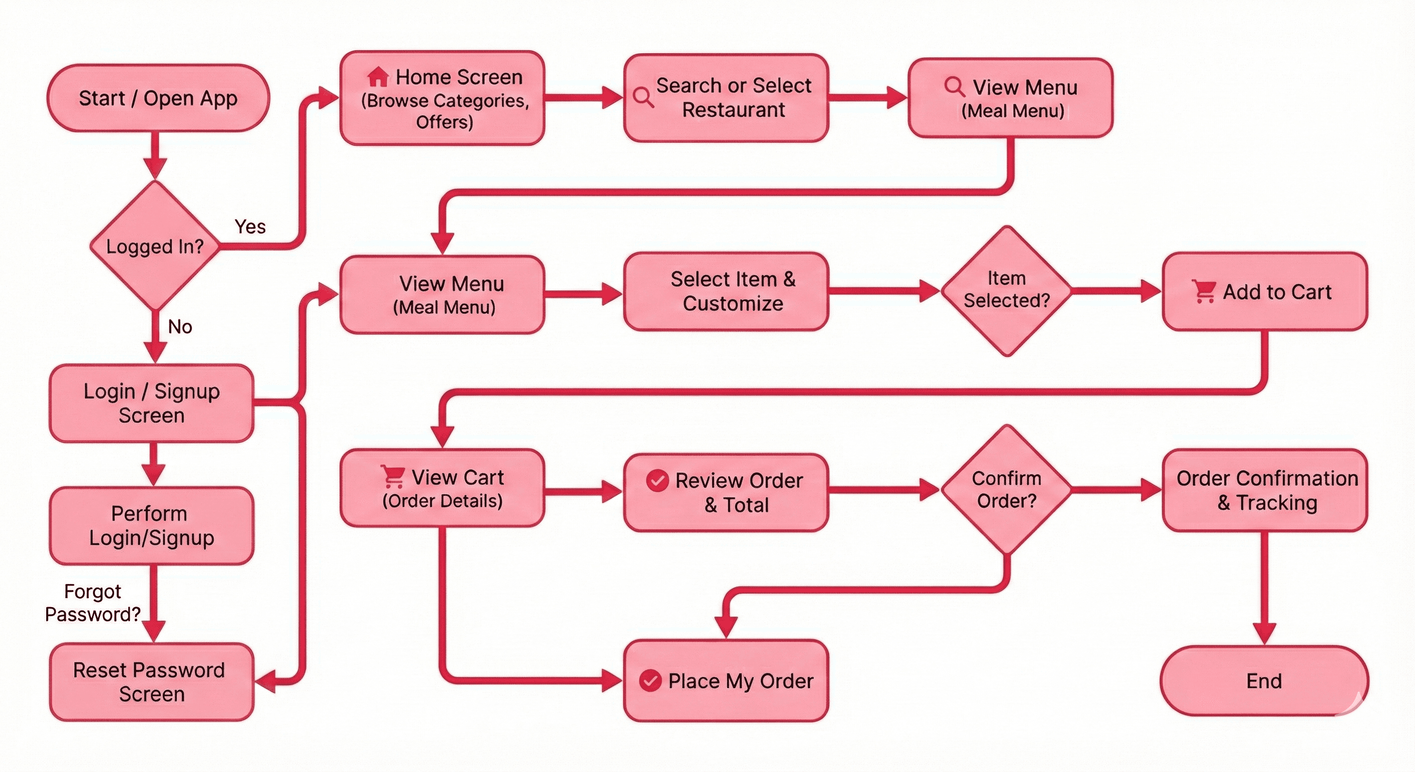
• Defined the IA and primary flows for browsing, selection, cart, and checkout.
• Created low-fidelity wireframes to validate scanning behavior.
• Produced high-fidelity UI emphasizing strong hierarchy and clean card layouts.
• Tested interactive prototypes with target users.
• Built a robust design system including color tokens, spacing, type scale, and motion rules.
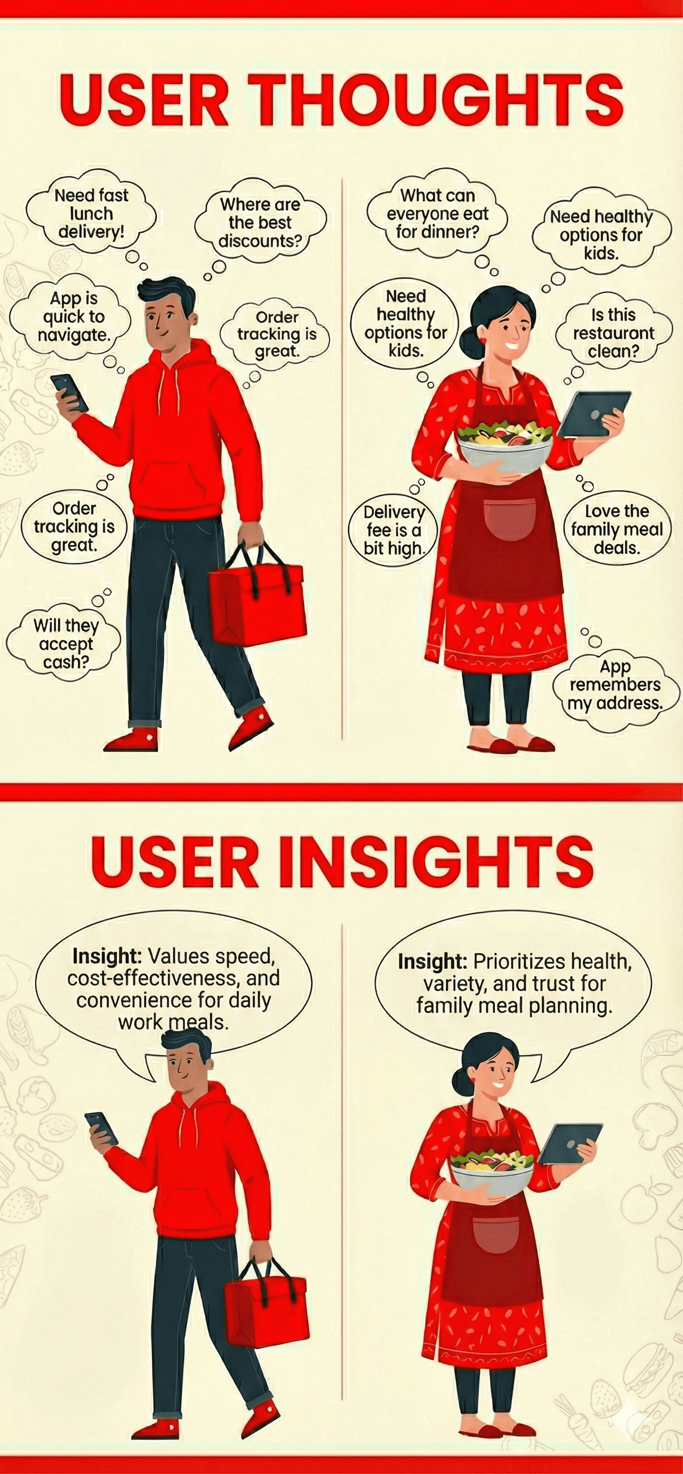
USER INSIGHTS & KEY ACTIONS:
• Users decide based on image, price, and rating first — redesigned product cards to elevate these three elements.
• Unclear fee structures damaged trust — added a unified cost breakdown in the checkout card.
• Frequent buyers expect rapid quantity controls — introduced single-tap add (+) and increment buttons.
• Category browsing improves with visual cues — implemented icon-based category chips for quick navigation.
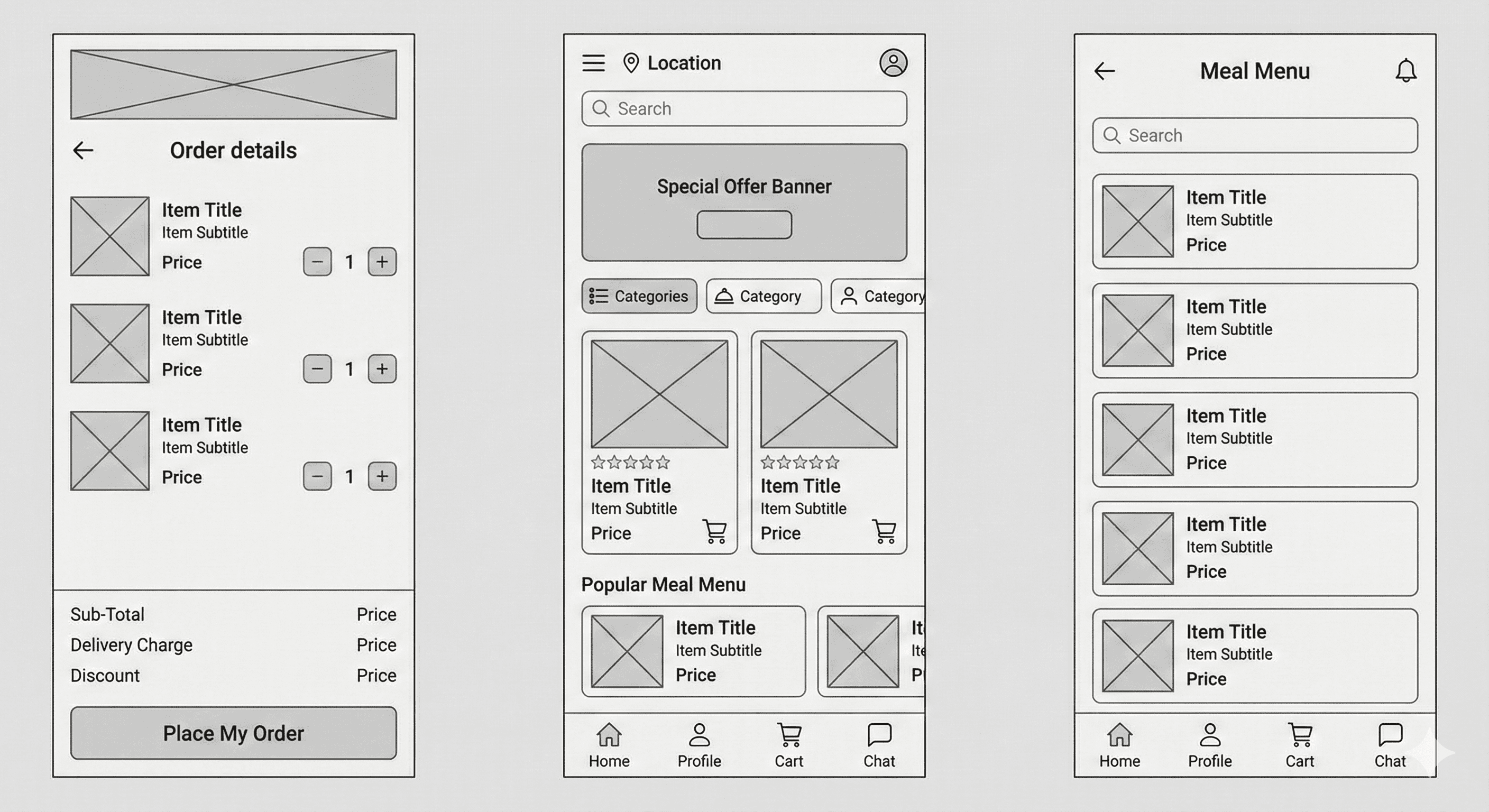
WIREFRAMES:
USER FLOW:
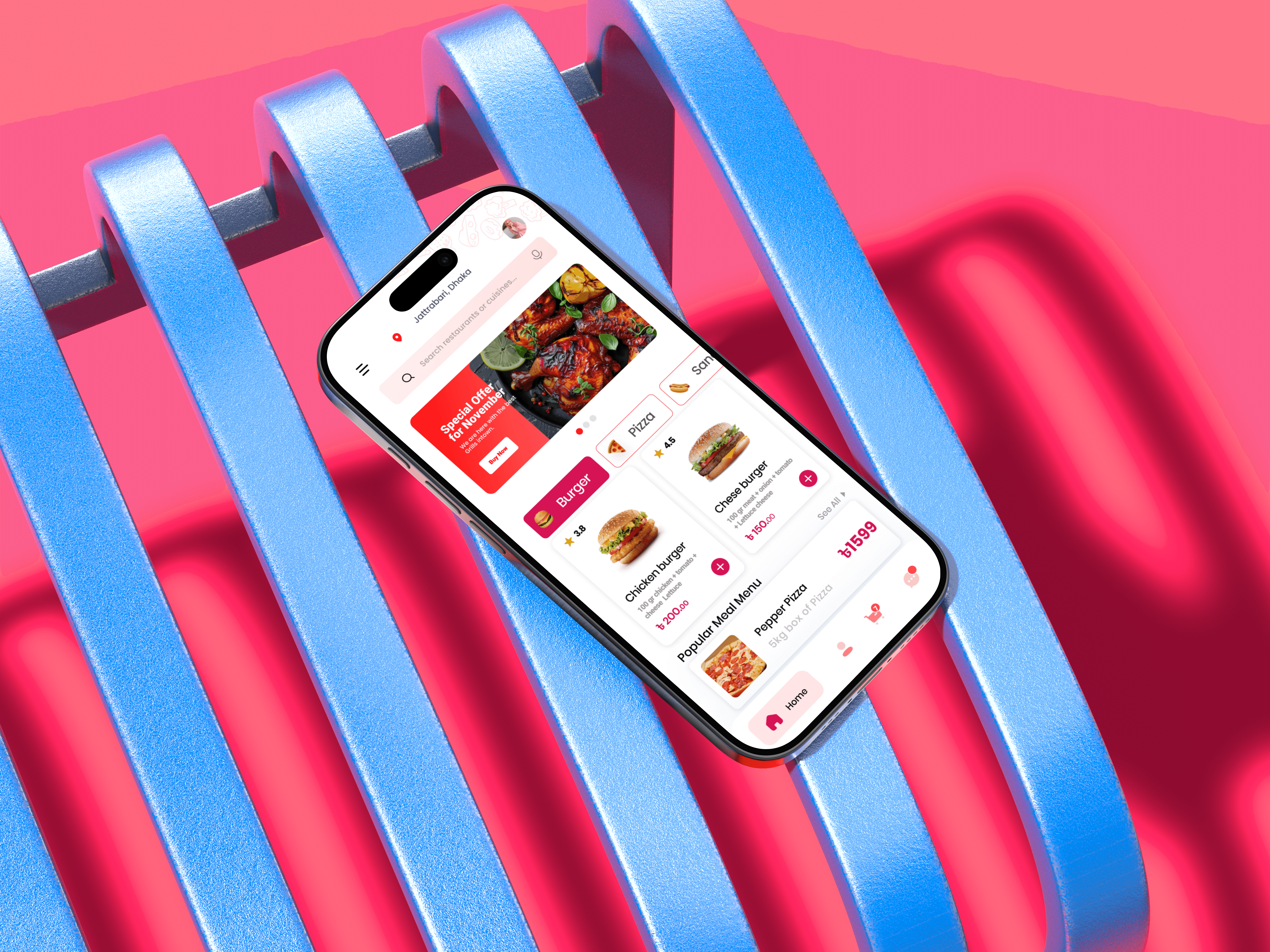
THE SOLUTION:
The final design creates a predictable, high-clarity experience from browsing to order placement.
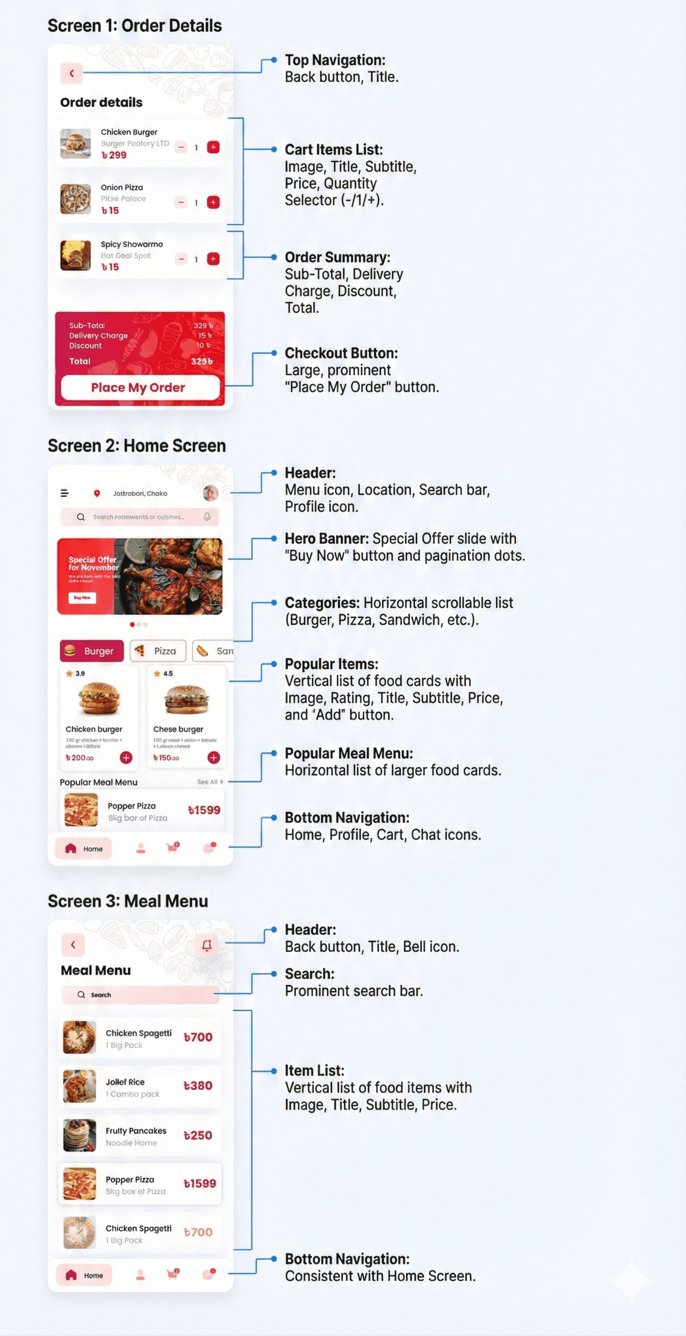
• Promotional hero with bold visuals to highlight daily offers.
• Category chips with icons for instant recognition and faster filtering.
• Product cards featuring rating, concise descriptions, strong imagery, and a high-contrast price.
• Lightweight meal list view with consistent spacing and simple search.
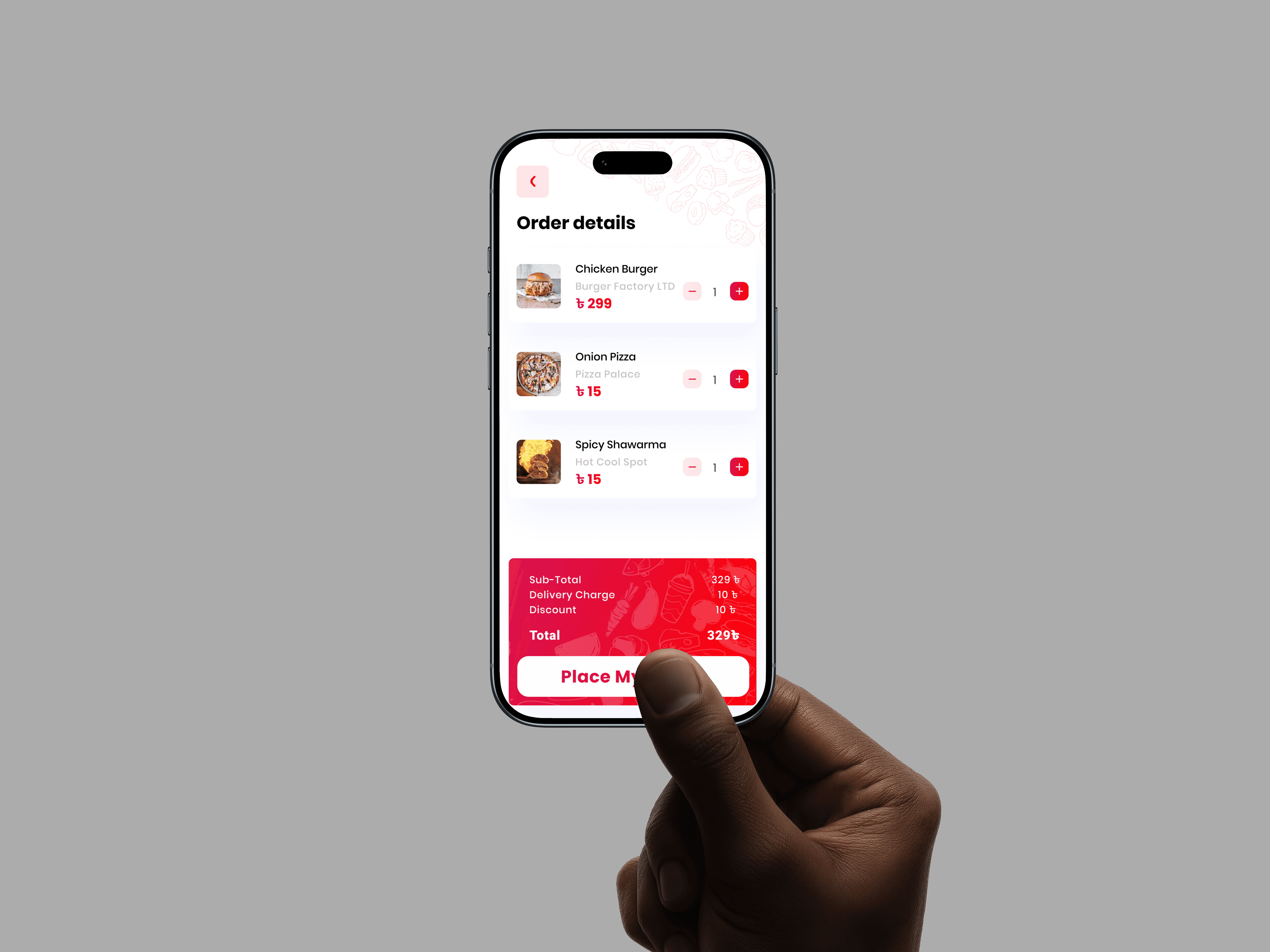
• Order details screen showing vendor attribution, quantity controls, and individual prices.
• Consolidated checkout card summarizing subtotal, delivery fee, discounts, and total, paired with a prominent Place My Order CTA.
• A unified design system enabling consistency across future screens and features.
UI DOCUMENTION :
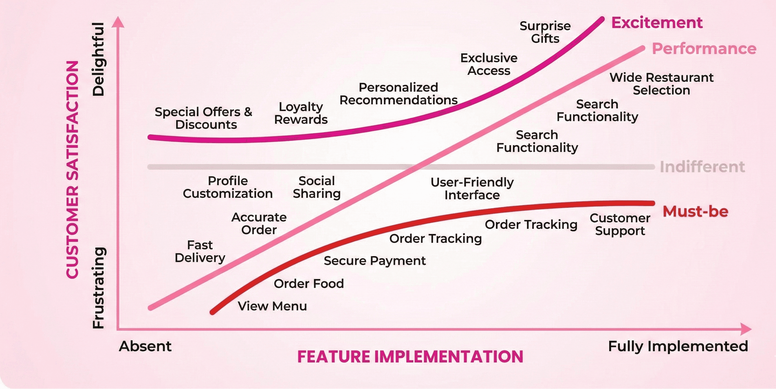
KANO MODEL :
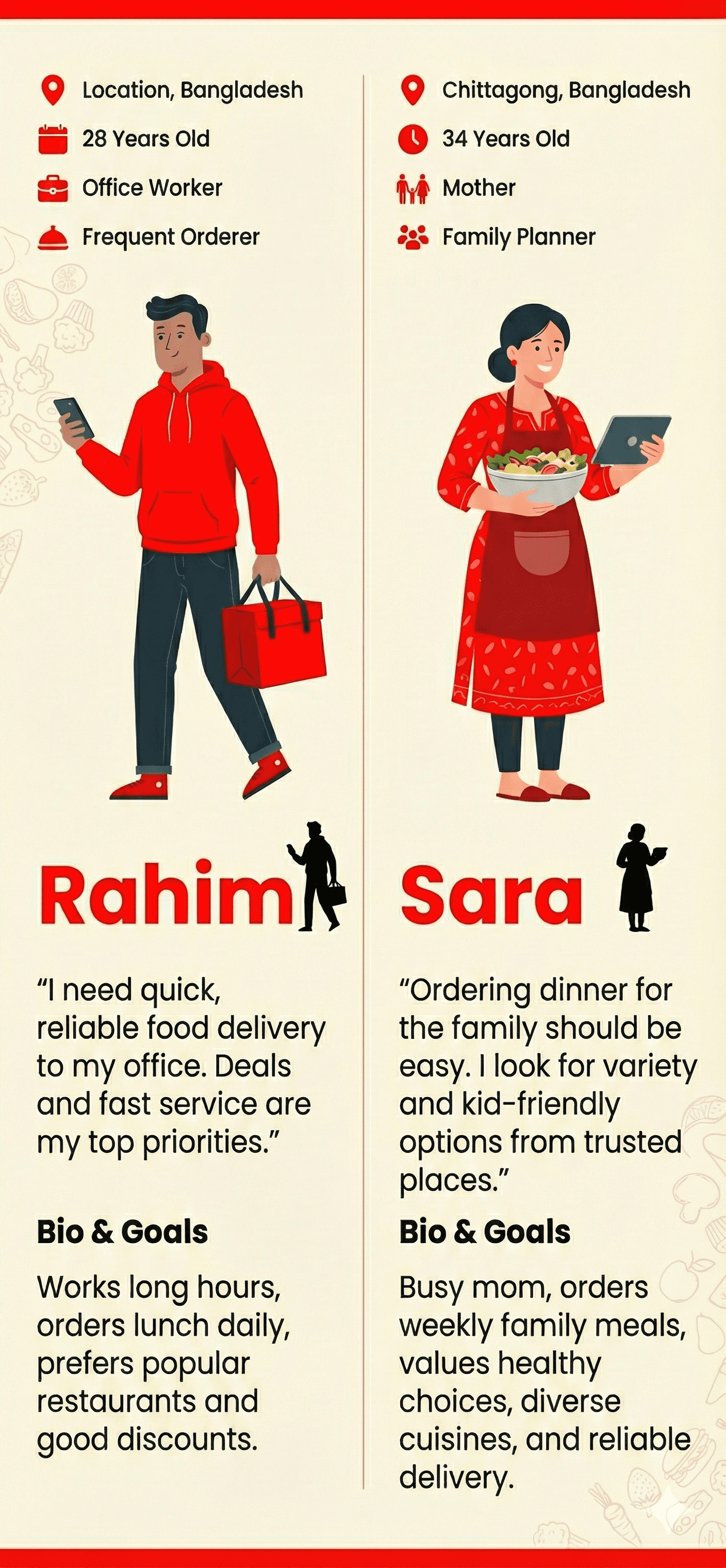
USER PERSONAS:
OUTCOME / RESULT:
• Enhanced browsing rhythm and visual hierarchy reduced cognitive load.
• Transparent pricing and fee breakdown improved user trust at checkout.
• Faster add-to-cart actions helped shorten the path to confirmed orders.
• The design system created long-term scalability for upcoming features such as delivery tracking and rewards.
LEARNING / CONCLUSION:
User sessions confirmed that clarity and perceived trust directly influence purchase completion in food delivery products. Future improvements include onboarding for first-time users, experiments with CTA hierarchy, and expanding the design system for order tracking and loyalty mechanisms.
More Works
(HNS® — 02)


FAQ
01
What’s your typical workflow for new projects?
02
How do you determine project timelines?
03
Do you design for both web and mobile?
04
What are your payment terms?
05
Can I update my website or app after launch?
06
Do you only work on fixed projects, or do you offer ongoing support?
07
Can you help with branding too?
08
What file formats will I receive for design handoff?
2024
GRABOO — FOOD DELIVERY APP
Graboo is a mobile-first food delivery product designed to simplify ordering from local restaurants, home kitchens, and trusted vendors.
UI/UX
MOBILE APP (AND)
ABOUT THE BRAND
Graboo® is a Dhaka-based food delivery brand dedicated to making meal ordering reliable and stress-free. The brand represents urban energy and youthful convenience-a platform that connects local restaurants to city residents who juggle work, study, and travel. Visually, Graboo embraces an energetic color palette inspired by street food culture, paired with modern typography and intuitive iconography. The identity is intentionally clean yet bold, balancing vibrancy with functional precision. Graboo positions itself as a dependable companion-fast when users need it, comforting when they don’t have time to think twice.
PROJECT OVERVIEW:
Graboo is a mobile-first food delivery product designed to simplify ordering from local restaurants, home kitchens, and trusted vendors. The objective was to craft a clean browsing experience, transparent pricing, and a friction-reduced checkout so users can order confidently and without effort.This case study covers the end-to-end creation of Graboo’s mobile experience. Scope included user research, journey mapping, information architecture, high-fidelity UI, and a component library ready for engineering. The work ensured the product launched with a clear browsing flow, consistent visual language, and predictable ordering behaviors across both iOS and Android.
PROJECT GOAL:
• Reduce user effort when scanning local meal options.
• Present prices and fees transparently to avoid hesitation.
• Design a fast, low-friction add-to-cart and checkout sequence.
• Establish a scalable, developer-friendly design system.
My Role:
Lead Product Designer (UX Strategy, UI Design, Prototyping, Design System, Developer Handoff)
THE PROBLEM:
Users in the local market struggled with menu clutter, unclear pricing, and unpredictable totals in existing apps. Confusion around fees and scattered UI patterns frequently led to abandoned carts. A more structured and trustworthy interface was required to support reliable, everyday ordering.
THE APPROACH AND PROCESS:
The workflow emphasized clarity, hierarchy, and early validation with real users while staying mindful of merchant constraints.
• Conducted interviews with diners and local vendors.
• Reviewed competitive apps for usability gaps and pricing clarity issues.
• Defined the IA and primary flows for browsing, selection, cart, and checkout.
• Created low-fidelity wireframes to validate scanning behavior.
• Produced high-fidelity UI emphasizing strong hierarchy and clean card layouts.
• Tested interactive prototypes with target users.
• Built a robust design system including color tokens, spacing, type scale, and motion rules.
USER INSIGHTS & KEY ACTIONS:
• Users decide based on image, price, and rating first — redesigned product cards to elevate these three elements.
• Unclear fee structures damaged trust — added a unified cost breakdown in the checkout card.
• Frequent buyers expect rapid quantity controls — introduced single-tap add (+) and increment buttons.
• Category browsing improves with visual cues — implemented icon-based category chips for quick navigation.
WIREFRAMES:
USER FLOW:
THE SOLUTION:
The final design creates a predictable, high-clarity experience from browsing to order placement.
• Promotional hero with bold visuals to highlight daily offers.
• Category chips with icons for instant recognition and faster filtering.
• Product cards featuring rating, concise descriptions, strong imagery, and a high-contrast price.
• Lightweight meal list view with consistent spacing and simple search.
• Order details screen showing vendor attribution, quantity controls, and individual prices.
• Consolidated checkout card summarizing subtotal, delivery fee, discounts, and total, paired with a prominent Place My Order CTA.
• A unified design system enabling consistency across future screens and features.
UI DOCUMENTION :
KANO MODEL :
USER PERSONAS:
OUTCOME / RESULT:
• Enhanced browsing rhythm and visual hierarchy reduced cognitive load.
• Transparent pricing and fee breakdown improved user trust at checkout.
• Faster add-to-cart actions helped shorten the path to confirmed orders.
• The design system created long-term scalability for upcoming features such as delivery tracking and rewards.
LEARNING / CONCLUSION:
User sessions confirmed that clarity and perceived trust directly influence purchase completion in food delivery products. Future improvements include onboarding for first-time users, experiments with CTA hierarchy, and expanding the design system for order tracking and loyalty mechanisms.
More Works
(HNS® — 02)
FAQ
01
What’s your typical workflow for new projects?
02
How do you determine project timelines?
03
Do you design for both web and mobile?
04
What are your payment terms?
05
Can I update my website or app after launch?
06
Do you only work on fixed projects, or do you offer ongoing support?
07
Can you help with branding too?
08
What file formats will I receive for design handoff?
2024
GRABOO — FOOD DELIVERY APP
Graboo is a mobile-first food delivery product designed to simplify ordering from local restaurants, home kitchens, and trusted vendors.
UI/UX
MOBILE APP (AND)
ABOUT THE BRAND
Graboo® is a Dhaka-based food delivery brand dedicated to making meal ordering reliable and stress-free. The brand represents urban energy and youthful convenience-a platform that connects local restaurants to city residents who juggle work, study, and travel. Visually, Graboo embraces an energetic color palette inspired by street food culture, paired with modern typography and intuitive iconography. The identity is intentionally clean yet bold, balancing vibrancy with functional precision. Graboo positions itself as a dependable companion-fast when users need it, comforting when they don’t have time to think twice.
PROJECT OVERVIEW:
Graboo is a mobile-first food delivery product designed to simplify ordering from local restaurants, home kitchens, and trusted vendors. The objective was to craft a clean browsing experience, transparent pricing, and a friction-reduced checkout so users can order confidently and without effort.This case study covers the end-to-end creation of Graboo’s mobile experience. Scope included user research, journey mapping, information architecture, high-fidelity UI, and a component library ready for engineering. The work ensured the product launched with a clear browsing flow, consistent visual language, and predictable ordering behaviors across both iOS and Android.
PROJECT GOAL:
• Reduce user effort when scanning local meal options.
• Present prices and fees transparently to avoid hesitation.
• Design a fast, low-friction add-to-cart and checkout sequence.
• Establish a scalable, developer-friendly design system.
My Role:
Lead Product Designer (UX Strategy, UI Design, Prototyping, Design System, Developer Handoff)
THE PROBLEM:
Users in the local market struggled with menu clutter, unclear pricing, and unpredictable totals in existing apps. Confusion around fees and scattered UI patterns frequently led to abandoned carts. A more structured and trustworthy interface was required to support reliable, everyday ordering.
THE APPROACH AND PROCESS:
The workflow emphasized clarity, hierarchy, and early validation with real users while staying mindful of merchant constraints.
• Conducted interviews with diners and local vendors.
• Reviewed competitive apps for usability gaps and pricing clarity issues.
• Defined the IA and primary flows for browsing, selection, cart, and checkout.
• Created low-fidelity wireframes to validate scanning behavior.
• Produced high-fidelity UI emphasizing strong hierarchy and clean card layouts.
• Tested interactive prototypes with target users.
• Built a robust design system including color tokens, spacing, type scale, and motion rules.
USER INSIGHTS & KEY ACTIONS:
• Users decide based on image, price, and rating first — redesigned product cards to elevate these three elements.
• Unclear fee structures damaged trust — added a unified cost breakdown in the checkout card.
• Frequent buyers expect rapid quantity controls — introduced single-tap add (+) and increment buttons.
• Category browsing improves with visual cues — implemented icon-based category chips for quick navigation.
WIREFRAMES:
USER FLOW:
THE SOLUTION:
The final design creates a predictable, high-clarity experience from browsing to order placement.
• Promotional hero with bold visuals to highlight daily offers.
• Category chips with icons for instant recognition and faster filtering.
• Product cards featuring rating, concise descriptions, strong imagery, and a high-contrast price.
• Lightweight meal list view with consistent spacing and simple search.
• Order details screen showing vendor attribution, quantity controls, and individual prices.
• Consolidated checkout card summarizing subtotal, delivery fee, discounts, and total, paired with a prominent Place My Order CTA.
• A unified design system enabling consistency across future screens and features.
UI DOCUMENTION :
KANO MODEL :
USER PERSONAS:
OUTCOME / RESULT:
• Enhanced browsing rhythm and visual hierarchy reduced cognitive load.
• Transparent pricing and fee breakdown improved user trust at checkout.
• Faster add-to-cart actions helped shorten the path to confirmed orders.
• The design system created long-term scalability for upcoming features such as delivery tracking and rewards.
LEARNING / CONCLUSION:
User sessions confirmed that clarity and perceived trust directly influence purchase completion in food delivery products. Future improvements include onboarding for first-time users, experiments with CTA hierarchy, and expanding the design system for order tracking and loyalty mechanisms.
More Works
FAQ
What’s your typical workflow for new projects?
How do you determine project timelines?
Do you design for both web and mobile?
What are your payment terms?
Can I update my website or app after launch?
Do you only work on fixed projects, or do you offer ongoing support?
Can you help with branding too?
What file formats will I receive for design handoff?