2023
Kofiwala – Mobile App
The mobile experience was designed to reduce friction in everyday coffee ordering while supporting a wide range of user needs, from quick reorders to detailed product exploration.
UI/UX
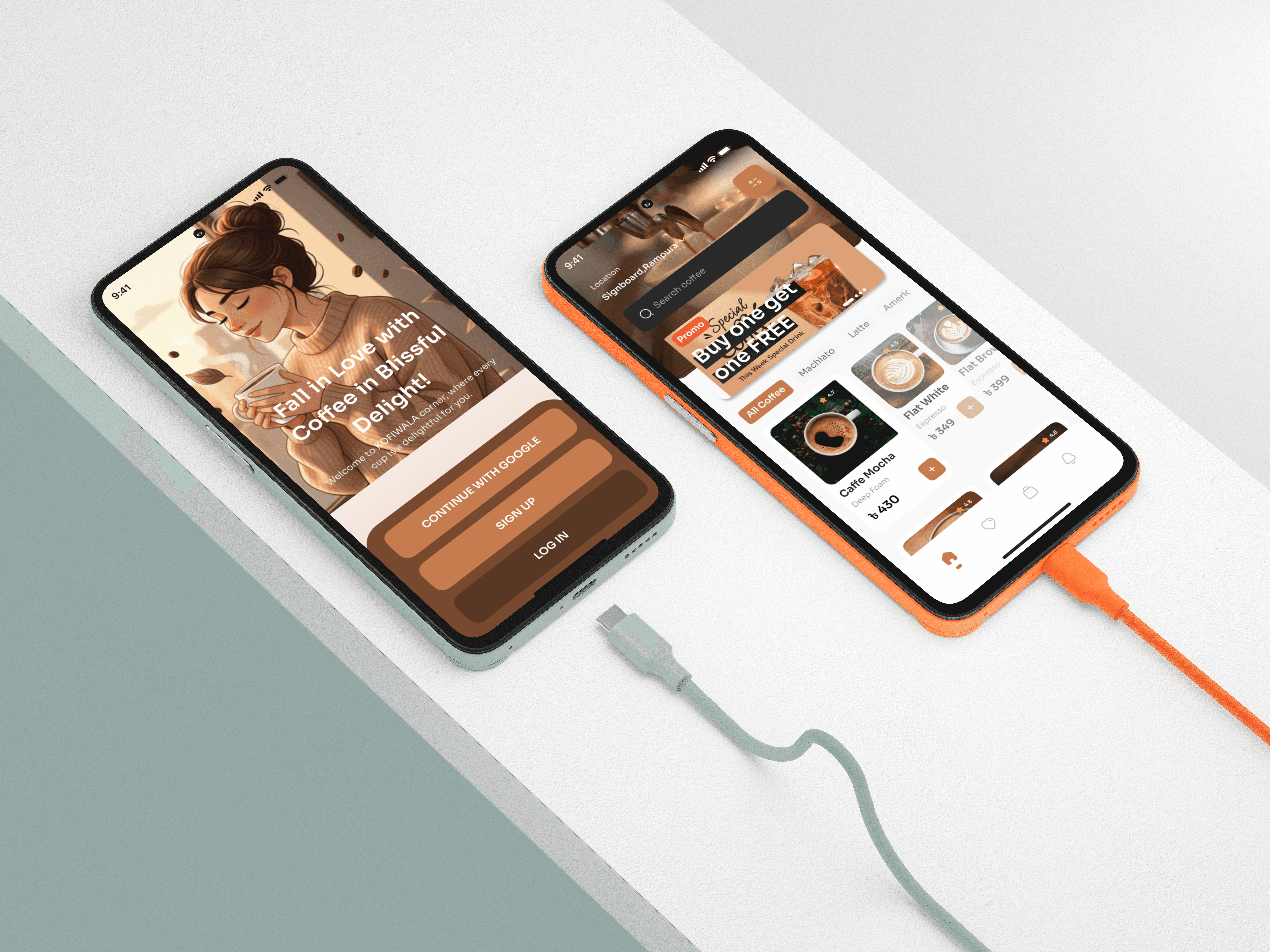
MOBILE APP (IOS)
ABOUT THE BRAND:
Kofiwala is a specialty coffee platform for people who treat their daily brew as a ritual. It curates high-quality beans, handcrafted drinks, and local café experiences through a smooth and reliable mobile interface. The brand prioritizes personalization, discovery, and café-level quality made effortless for everyday users.
PROJECT OVERVIEW:
This project focuses on designing a clean, dependable, and café-centric ordering journey for Kofiwala, a specialty coffee app built around quality and personalization. The work includes item detail exploration, customized ordering options, delivery and pickup workflows, and transparent payment summaries. The goal was to build a premium yet intuitive interface that feels crafted for serious coffee lovers.

PROJECT GOAL:
The objective was to build a premium ordering journey that feels intentional, fast, and easy for users who expect consistency and control. The experience needed to support both detailed exploration of drinks and efficient checkout while emphasizing trust, quality, and clarity.
MY ROLE :
Lead Product Designer
(UX Strategy, UI Design, Prototyping, Design System, Developer Handoff)


THE PROBLEM:
Users often struggle with cluttered coffee ordering apps that hide key information, overload decision points, and break the flow with confusing summaries. The challenge was to design an interface that balances detail with speed—allowing serious coffee drinkers to customize confidently while keeping the process lightweight and intuitive.
THE APPROACH AND PROCESS:
The design approach centered on simplifying high-intent actions while surfacing the most relevant information at the right moments. Each screen was crafted to maintain visual calm, reduce decision fatigue, and guide the user smoothly from discovery to confirmation.
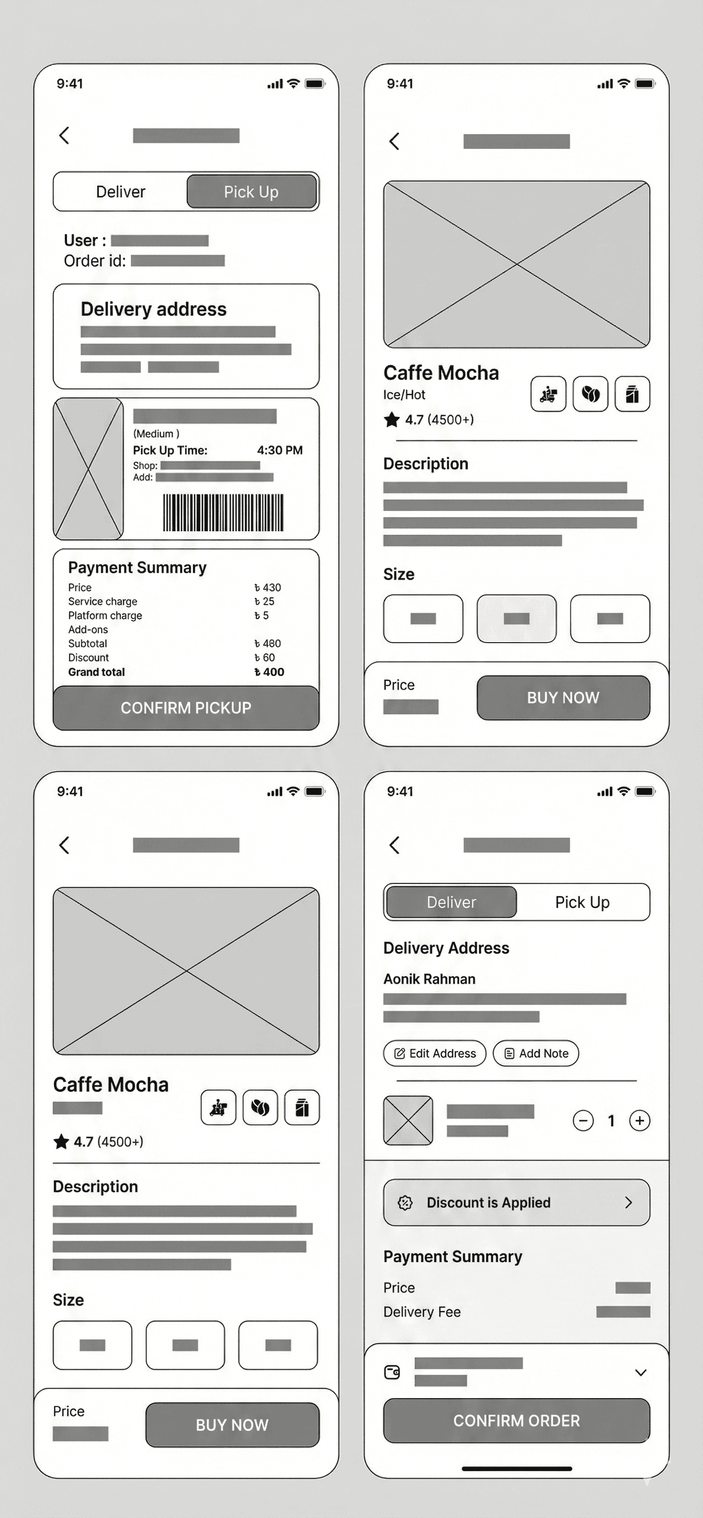
• Structured the flow into clear stages: discovery → customization → delivery/pickup → confirmation.
• Refined the item detail page with large imagery, clear size selection, and concise product context.
• Applied a transparent pricing model with live summaries and discount visibility.
• Designed dual-mode ordering (delivery and pickup) to support different user routines.
• Added actionable micro-interactions (edit address, add note, adjust quantity) to keep navigation minimal.
• Used consistent color roles to reinforce hierarchy and reduce cognitive load.
• Ensured all touchpoints remain readable and responsive across device sizes.
USER INSIGHTS & KEY ACTIONS:
Users prioritize clarity, quick adjustments, and the ability to choose between delivery and pickup depending on their schedule. They expect to see accurate prices, simple customization options, and trustworthy summaries without scanning multiple sections.
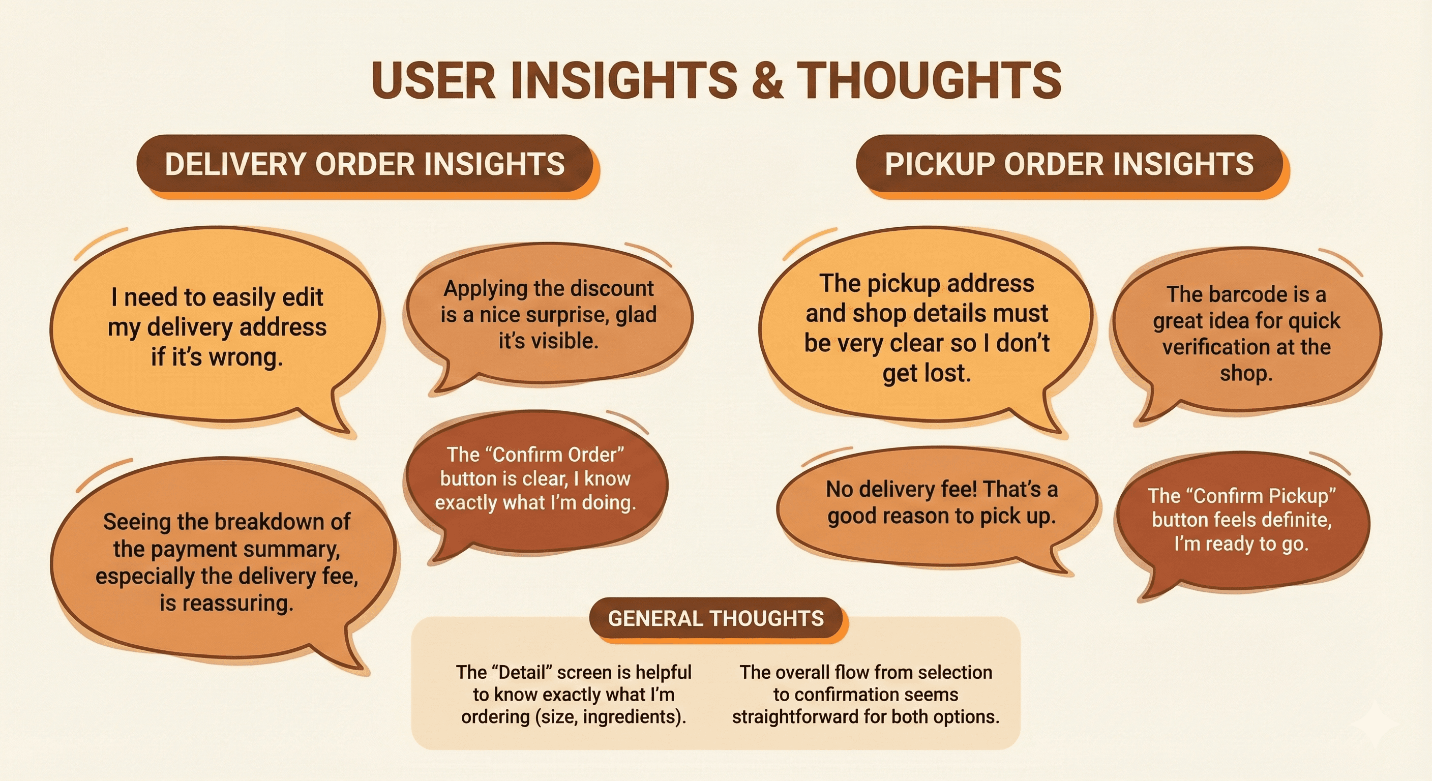
• Created large, tappable UI elements to reduce friction during customization.
• Surfaced real-time changes in quantity, price, and fees to build user confidence.
• Added note-taking for preferences, addressing niche needs of coffee enthusiasts.
• Introduced pickup barcode and timing details for easy in-store retrieval.
• Streamlined the payment card with clear wallet balance visibility.
WIREFRAMES:
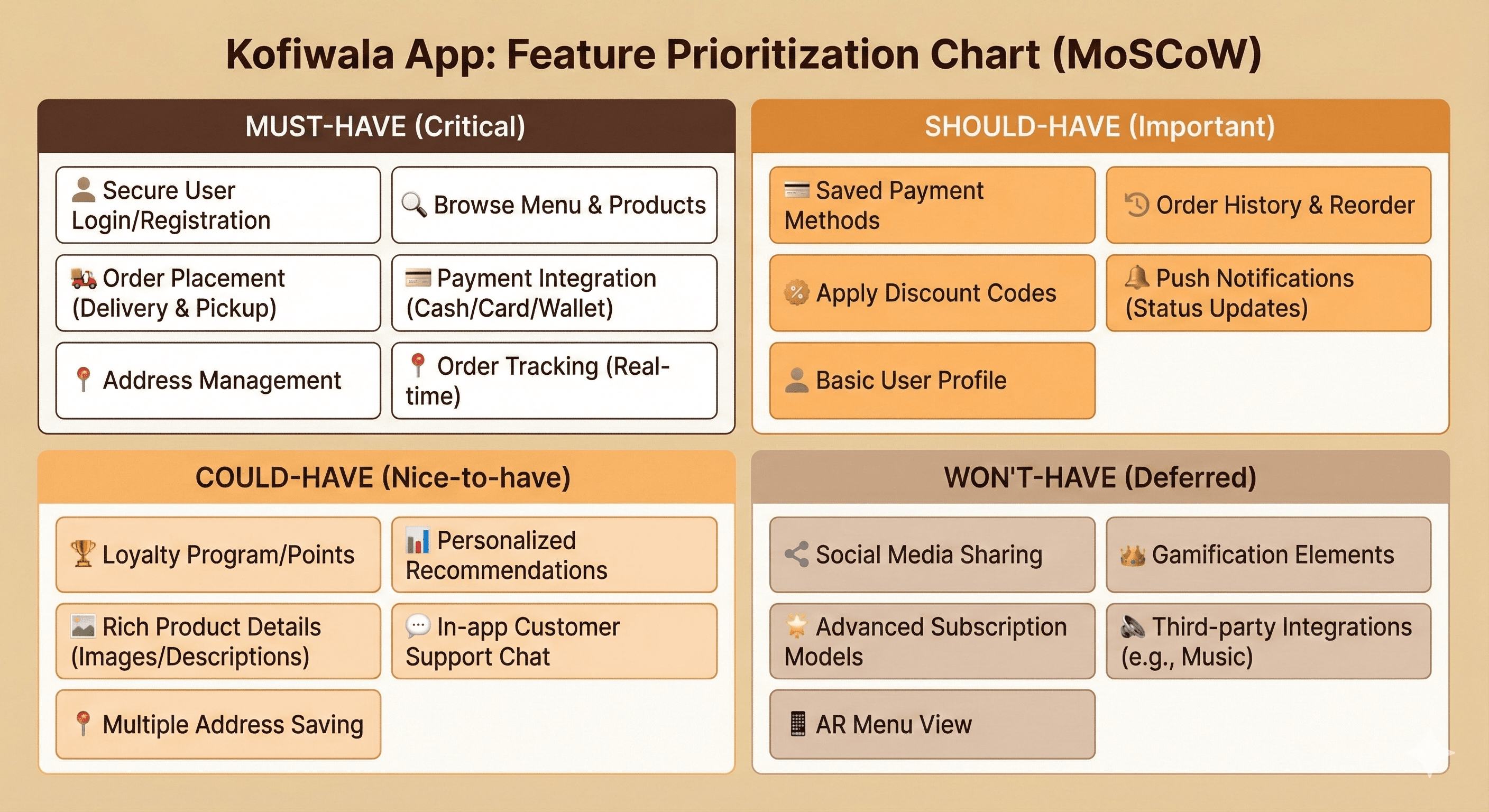
MoSCoW:

THE SOLUTION:
The final solution delivers a premium, structured ordering flow that respects the user’s time while supporting deeper customization when desired. Each screen balances warmth and precision, guided by a minimal aesthetic that aligns with the brand’s specialty coffee identity.
• High-fidelity item detail page with clear ratings, categories, and size selection.
• Delivery and pickup modes designed as parallel flows with unique content and summaries.
• Transparent payment section showing subtotal, discounts, service fees, and final total.
• Actionable components such as edit address, add note, and quantity adjustment.
• Visual consistency achieved through refined spacing, soft color tones, and strong typographic hierarchy.
• Pickup confirmation featuring barcode, pickup time, café location, and additional notes for in-store accuracy.
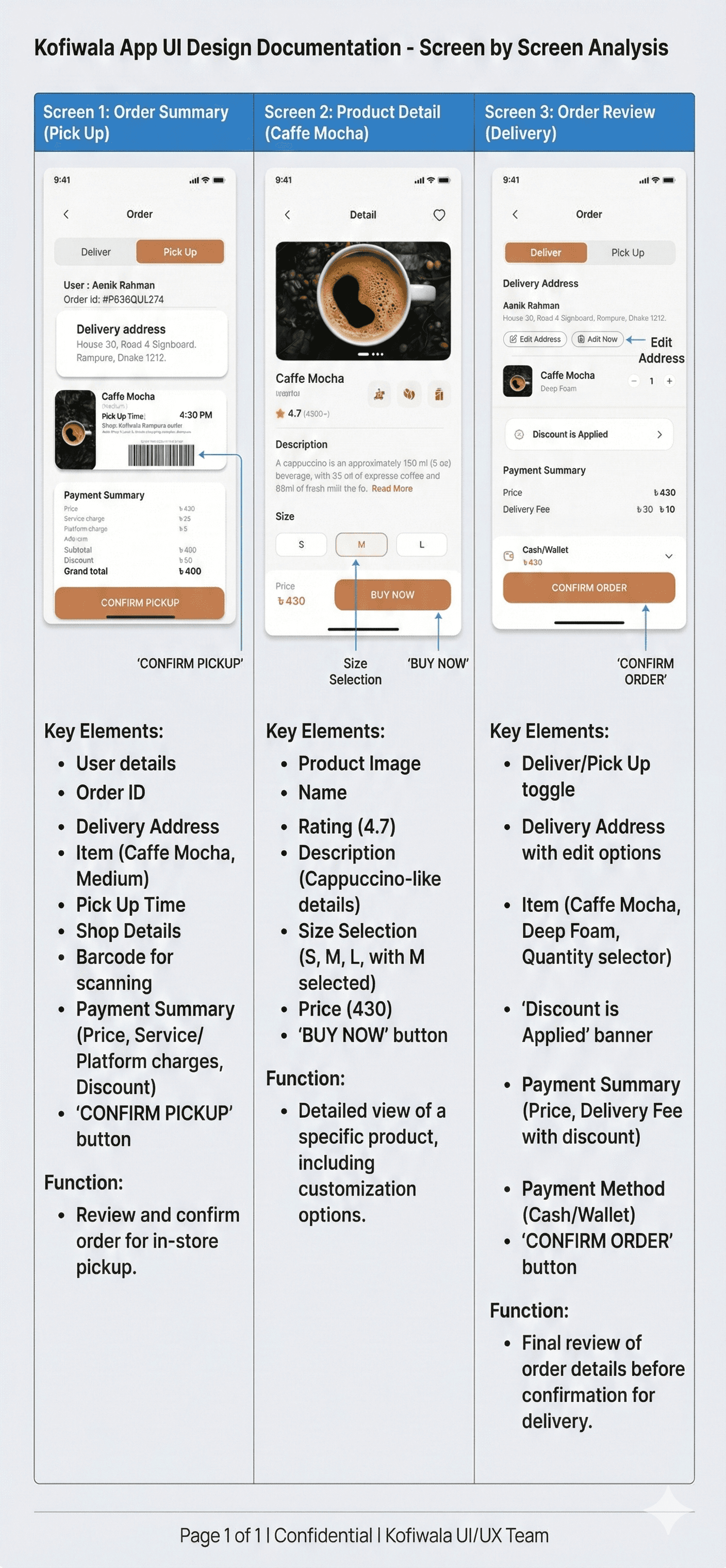
UI DOCUMENTION:
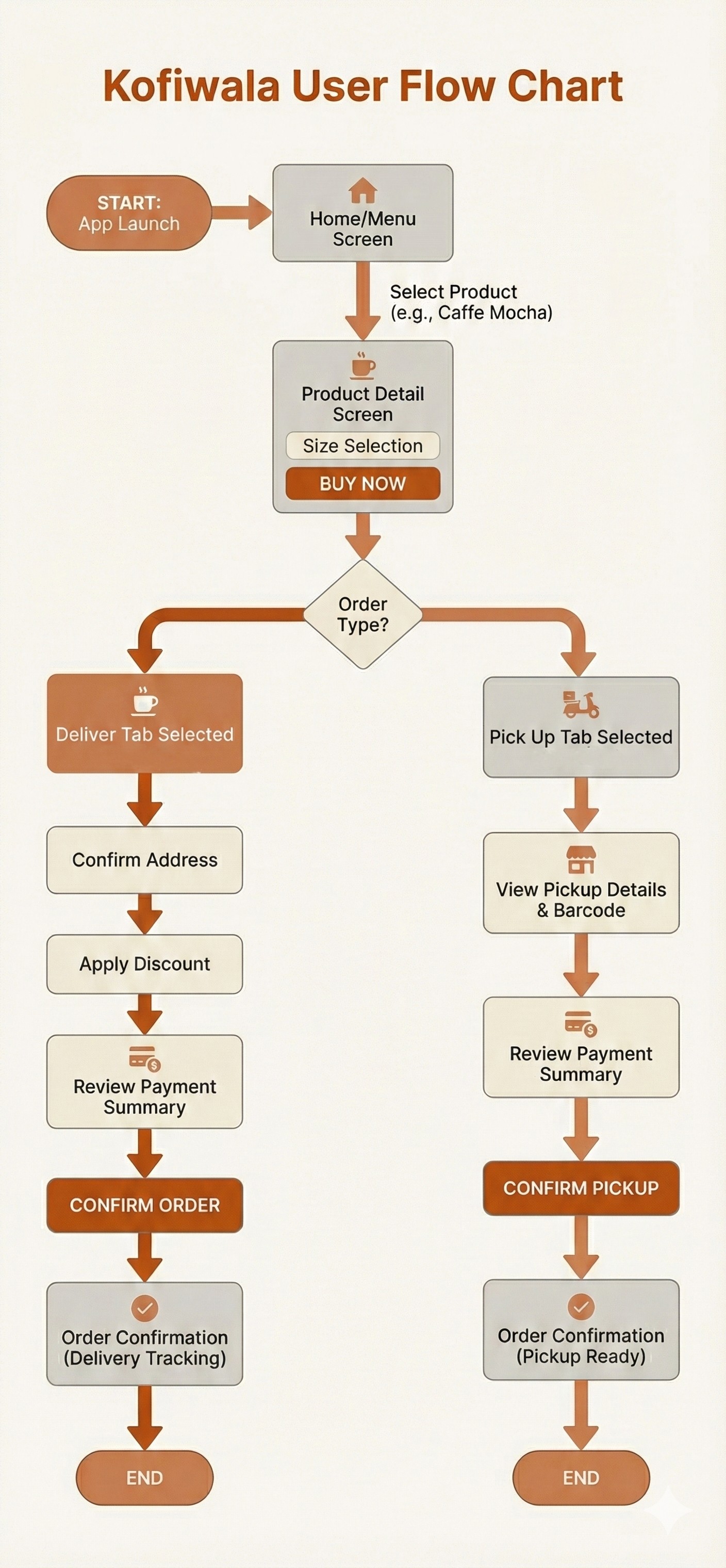
USER FLOW:
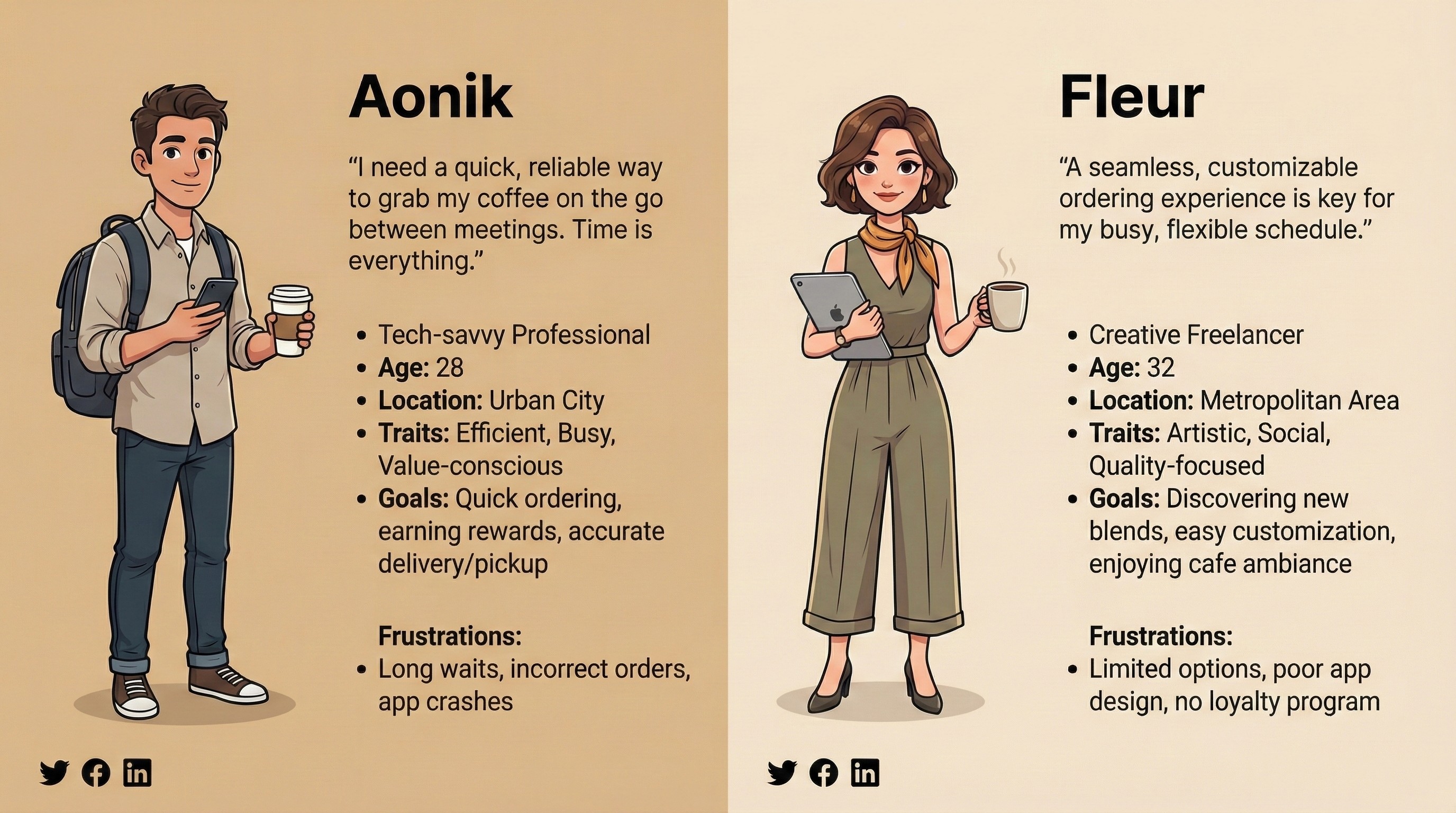
USER PERSONAS:
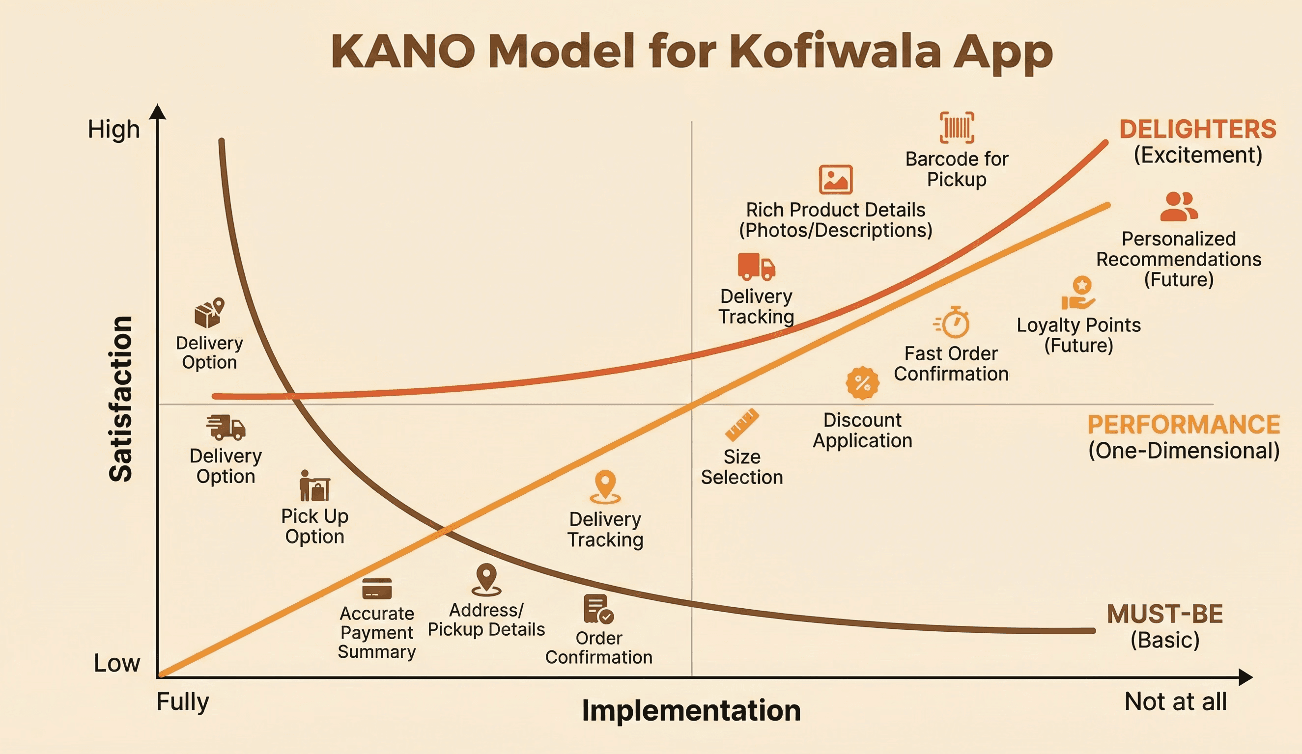
KANO MODEL:
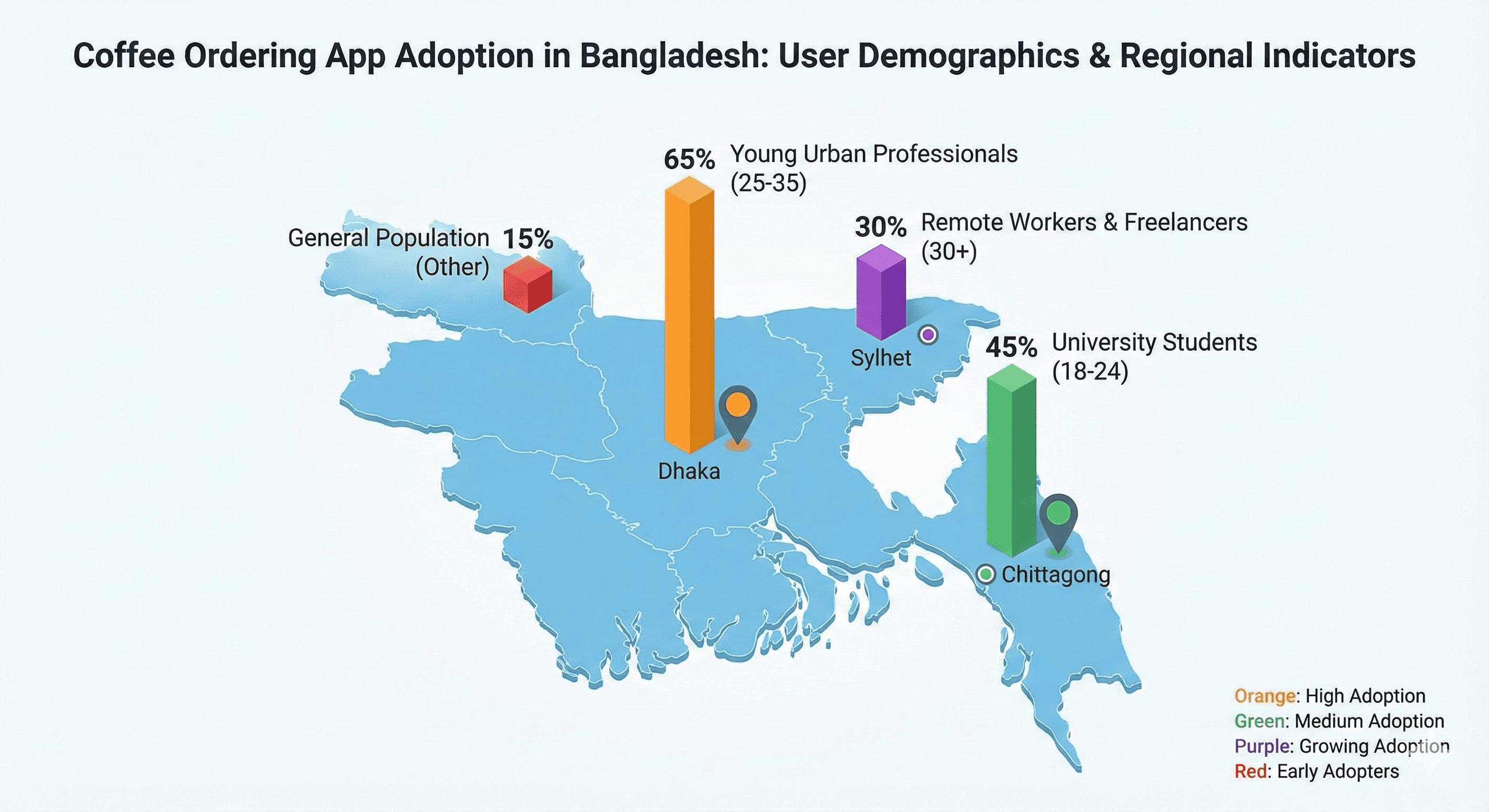
USERS DEMO-GRAPHICS CHART:
OUTCOME / RESULT:
The redesigned ordering flow reduces decision fatigue and increases user confidence across both delivery and pickup experiences. The transparency in pricing and customization supports informed choices, while the visual refinement creates a calm, premium feel aligned with Kofiwala’s brand. Users benefit from faster ordering, fewer errors, and a smoother sense of control throughout the process.
LEARNING / CONCLUSION:
The project demonstrated the importance of balancing detail and speed for high-intent purchase flows. Clear hierarchy, transparency, and intentionally placed actions significantly improved usability for coffee-focused users. Building parallel yet consistent flows for delivery and pickup ensured flexibility without complexity. The final experience reinforces Kofiwala’s promise: high-quality coffee ordering made simple and dependable.
More Works
(HNS® — 02)


FAQ
01
What’s your typical workflow for new projects?
02
How do you determine project timelines?
03
Do you design for both web and mobile?
04
What are your payment terms?
05
Can I update my website or app after launch?
06
Do you only work on fixed projects, or do you offer ongoing support?
07
Can you help with branding too?
08
What file formats will I receive for design handoff?
2023
Kofiwala – Mobile App
The mobile experience was designed to reduce friction in everyday coffee ordering while supporting a wide range of user needs, from quick reorders to detailed product exploration.
UI/UX
MOBILE APP (IOS)
ABOUT THE BRAND:
Kofiwala is a specialty coffee platform for people who treat their daily brew as a ritual. It curates high-quality beans, handcrafted drinks, and local café experiences through a smooth and reliable mobile interface. The brand prioritizes personalization, discovery, and café-level quality made effortless for everyday users.
PROJECT OVERVIEW:
This project focuses on designing a clean, dependable, and café-centric ordering journey for Kofiwala, a specialty coffee app built around quality and personalization. The work includes item detail exploration, customized ordering options, delivery and pickup workflows, and transparent payment summaries. The goal was to build a premium yet intuitive interface that feels crafted for serious coffee lovers.
PROJECT GOAL:
The objective was to build a premium ordering journey that feels intentional, fast, and easy for users who expect consistency and control. The experience needed to support both detailed exploration of drinks and efficient checkout while emphasizing trust, quality, and clarity.
MY ROLE :
Lead Product Designer
(UX Strategy, UI Design, Prototyping, Design System, Developer Handoff)
THE PROBLEM:
Users often struggle with cluttered coffee ordering apps that hide key information, overload decision points, and break the flow with confusing summaries. The challenge was to design an interface that balances detail with speed—allowing serious coffee drinkers to customize confidently while keeping the process lightweight and intuitive.
THE APPROACH AND PROCESS:
The design approach centered on simplifying high-intent actions while surfacing the most relevant information at the right moments. Each screen was crafted to maintain visual calm, reduce decision fatigue, and guide the user smoothly from discovery to confirmation.
• Structured the flow into clear stages: discovery → customization → delivery/pickup → confirmation.
• Refined the item detail page with large imagery, clear size selection, and concise product context.
• Applied a transparent pricing model with live summaries and discount visibility.
• Designed dual-mode ordering (delivery and pickup) to support different user routines.
• Added actionable micro-interactions (edit address, add note, adjust quantity) to keep navigation minimal.
• Used consistent color roles to reinforce hierarchy and reduce cognitive load.
• Ensured all touchpoints remain readable and responsive across device sizes.
USER INSIGHTS & KEY ACTIONS:
Users prioritize clarity, quick adjustments, and the ability to choose between delivery and pickup depending on their schedule. They expect to see accurate prices, simple customization options, and trustworthy summaries without scanning multiple sections.
• Created large, tappable UI elements to reduce friction during customization.
• Surfaced real-time changes in quantity, price, and fees to build user confidence.
• Added note-taking for preferences, addressing niche needs of coffee enthusiasts.
• Introduced pickup barcode and timing details for easy in-store retrieval.
• Streamlined the payment card with clear wallet balance visibility.
WIREFRAMES:
MoSCoW:
THE SOLUTION:
The final solution delivers a premium, structured ordering flow that respects the user’s time while supporting deeper customization when desired. Each screen balances warmth and precision, guided by a minimal aesthetic that aligns with the brand’s specialty coffee identity.
• High-fidelity item detail page with clear ratings, categories, and size selection.
• Delivery and pickup modes designed as parallel flows with unique content and summaries.
• Transparent payment section showing subtotal, discounts, service fees, and final total.
• Actionable components such as edit address, add note, and quantity adjustment.
• Visual consistency achieved through refined spacing, soft color tones, and strong typographic hierarchy.
• Pickup confirmation featuring barcode, pickup time, café location, and additional notes for in-store accuracy.
UI DOCUMENTION:
USER FLOW:
USER PERSONAS:
KANO MODEL:
USERS DEMO-GRAPHICS CHART:
OUTCOME / RESULT:
The redesigned ordering flow reduces decision fatigue and increases user confidence across both delivery and pickup experiences. The transparency in pricing and customization supports informed choices, while the visual refinement creates a calm, premium feel aligned with Kofiwala’s brand. Users benefit from faster ordering, fewer errors, and a smoother sense of control throughout the process.
LEARNING / CONCLUSION:
The project demonstrated the importance of balancing detail and speed for high-intent purchase flows. Clear hierarchy, transparency, and intentionally placed actions significantly improved usability for coffee-focused users. Building parallel yet consistent flows for delivery and pickup ensured flexibility without complexity. The final experience reinforces Kofiwala’s promise: high-quality coffee ordering made simple and dependable.
More Works
(HNS® — 02)
FAQ
01
What’s your typical workflow for new projects?
02
How do you determine project timelines?
03
Do you design for both web and mobile?
04
What are your payment terms?
05
Can I update my website or app after launch?
06
Do you only work on fixed projects, or do you offer ongoing support?
07
Can you help with branding too?
08
What file formats will I receive for design handoff?
2023
Kofiwala – Mobile App
The mobile experience was designed to reduce friction in everyday coffee ordering while supporting a wide range of user needs, from quick reorders to detailed product exploration.
UI/UX
MOBILE APP (IOS)
ABOUT THE BRAND:
Kofiwala is a specialty coffee platform for people who treat their daily brew as a ritual. It curates high-quality beans, handcrafted drinks, and local café experiences through a smooth and reliable mobile interface. The brand prioritizes personalization, discovery, and café-level quality made effortless for everyday users.
PROJECT OVERVIEW:
This project focuses on designing a clean, dependable, and café-centric ordering journey for Kofiwala, a specialty coffee app built around quality and personalization. The work includes item detail exploration, customized ordering options, delivery and pickup workflows, and transparent payment summaries. The goal was to build a premium yet intuitive interface that feels crafted for serious coffee lovers.
PROJECT GOAL:
The objective was to build a premium ordering journey that feels intentional, fast, and easy for users who expect consistency and control. The experience needed to support both detailed exploration of drinks and efficient checkout while emphasizing trust, quality, and clarity.
MY ROLE :
Lead Product Designer
(UX Strategy, UI Design, Prototyping, Design System, Developer Handoff)
THE PROBLEM:
Users often struggle with cluttered coffee ordering apps that hide key information, overload decision points, and break the flow with confusing summaries. The challenge was to design an interface that balances detail with speed—allowing serious coffee drinkers to customize confidently while keeping the process lightweight and intuitive.
THE APPROACH AND PROCESS:
The design approach centered on simplifying high-intent actions while surfacing the most relevant information at the right moments. Each screen was crafted to maintain visual calm, reduce decision fatigue, and guide the user smoothly from discovery to confirmation.
• Structured the flow into clear stages: discovery → customization → delivery/pickup → confirmation.
• Refined the item detail page with large imagery, clear size selection, and concise product context.
• Applied a transparent pricing model with live summaries and discount visibility.
• Designed dual-mode ordering (delivery and pickup) to support different user routines.
• Added actionable micro-interactions (edit address, add note, adjust quantity) to keep navigation minimal.
• Used consistent color roles to reinforce hierarchy and reduce cognitive load.
• Ensured all touchpoints remain readable and responsive across device sizes.
USER INSIGHTS & KEY ACTIONS:
Users prioritize clarity, quick adjustments, and the ability to choose between delivery and pickup depending on their schedule. They expect to see accurate prices, simple customization options, and trustworthy summaries without scanning multiple sections.
• Created large, tappable UI elements to reduce friction during customization.
• Surfaced real-time changes in quantity, price, and fees to build user confidence.
• Added note-taking for preferences, addressing niche needs of coffee enthusiasts.
• Introduced pickup barcode and timing details for easy in-store retrieval.
• Streamlined the payment card with clear wallet balance visibility.
WIREFRAMES:
MoSCoW:
THE SOLUTION:
The final solution delivers a premium, structured ordering flow that respects the user’s time while supporting deeper customization when desired. Each screen balances warmth and precision, guided by a minimal aesthetic that aligns with the brand’s specialty coffee identity.
• High-fidelity item detail page with clear ratings, categories, and size selection.
• Delivery and pickup modes designed as parallel flows with unique content and summaries.
• Transparent payment section showing subtotal, discounts, service fees, and final total.
• Actionable components such as edit address, add note, and quantity adjustment.
• Visual consistency achieved through refined spacing, soft color tones, and strong typographic hierarchy.
• Pickup confirmation featuring barcode, pickup time, café location, and additional notes for in-store accuracy.
UI DOCUMENTION:
USER FLOW:
USER PERSONAS:
KANO MODEL:
USERS DEMO-GRAPHICS CHART:
OUTCOME / RESULT:
The redesigned ordering flow reduces decision fatigue and increases user confidence across both delivery and pickup experiences. The transparency in pricing and customization supports informed choices, while the visual refinement creates a calm, premium feel aligned with Kofiwala’s brand. Users benefit from faster ordering, fewer errors, and a smoother sense of control throughout the process.
LEARNING / CONCLUSION:
The project demonstrated the importance of balancing detail and speed for high-intent purchase flows. Clear hierarchy, transparency, and intentionally placed actions significantly improved usability for coffee-focused users. Building parallel yet consistent flows for delivery and pickup ensured flexibility without complexity. The final experience reinforces Kofiwala’s promise: high-quality coffee ordering made simple and dependable.
More Works
FAQ
What’s your typical workflow for new projects?
How do you determine project timelines?
Do you design for both web and mobile?
What are your payment terms?
Can I update my website or app after launch?
Do you only work on fixed projects, or do you offer ongoing support?
Can you help with branding too?
What file formats will I receive for design handoff?